Action Plan and Project Management Icons
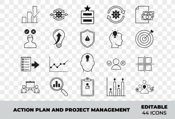
Clear visual language accelerates understanding—especially when teams are aligning on goals, tracking progress, or communicating complex workflows. The Action Plan and Project Management Icons set delivers precisely that: a cohesive, high-fidelity collection of outline-style vector icons designed for real-world use across business, digital product development, and personal productivity systems.
These aren’t decorative flourishes. Each icon serves a functional role in clarifying process—whether it’s mapping a sprint backlog, labeling dashboard metrics, illustrating a project timeline in a client presentation, or guiding users through onboarding steps in a SaaS application. Their consistent stroke weight, balanced proportions, and intentional negative space make them legible at small sizes and scalable without loss of clarity—critical for responsive interfaces and printed materials alike.
Where These Icons Fit Into Real Workflows
Icons rarely exist in isolation. They’re embedded into larger systems—tools, templates, platforms, and human interactions. The Action Plan and Project Management Icons set supports those systems at multiple stages:
- Before action: Use icons to pre-define structure—e.g., sketching a workflow diagram in Figma with task, approval, and handoff icons; building a Notion project template with status indicators (planning, in review, completed); or designing a workshop agenda slide deck where each phase is anchored by a relevant icon (strategy, analysis, execution, reflection).
- During action: Integrate them directly into live tools—customizing Jira issue types with distinct icons, adding visual cues to Trello cards, or embedding them in internal Slack channel headers to signal purpose (e.g., #project-q3-launch uses the “roadmap” icon; #analytics-review uses the “reporting” icon).
- After action: Repurpose icons for retrospectives and documentation—annotating post-mortem slides with “teamwork,” “communication,” and “checklist” icons to highlight collaboration patterns; or using the “analytics” and “workflow” icons side-by-side in a case study to show how process changes led to measurable outcomes.
This flexibility comes from intentionality in design—not just aesthetics, but semantic precision. The “checklist” icon doesn’t mimic a generic list; it implies verification and completion. The “strategy” icon avoids abstract metaphors and instead uses clean geometry to suggest alignment and direction. That consistency reduces cognitive load, especially for global or cross-functional teams interpreting visuals quickly.
Integration With Tools You Already Use
The EPS vector format ensures compatibility with professional design environments—Adobe Illustrator, Affinity Designer, Sketch (via plugins), and Figma (with vector import). Because every icon is fully editable, you can adjust stroke width, recolor on-the-fly, combine elements, or isolate parts for animation. No need to hunt for matching styles across disparate sources.
For developers and product teams: export SVGs directly from Illustrator for use in web UIs. The clean outlines and minimal anchor points keep file sizes small and rendering predictable across browsers and devices. Pair them with your existing design system tokens—assign the “task management” icon to a .status-in-progress class, or use the “communication” icon as a reusable React component prop.
Marketers and educators benefit from JPEG previews for quick mockups in PowerPoint or Canva—no design software required. Drop an icon next to a bullet point in a social media carousel about time-blocking techniques, or layer the “analytics” icon over a chart thumbnail in a LinkedIn post. The preview files maintain visual fidelity while streamlining early-stage content creation.
Practical Implementation Tips
Start small. Pick one recurring use case—like standardizing status labels across your team’s shared documents—and apply three to five icons consistently. For example: “planning” (blue), “in progress” (orange), “review” (purple), “completed” (green), and “blocked” (gray). Repeating this pattern builds visual muscle memory faster than introducing dozens of icons at once.
Organize your library intentionally. Create subfolders or naming conventions that mirror how you think about work: /workflow/, /planning/, /team-collab/, /data-reporting/. This mirrors mental models used in daily planning and makes retrieval faster during tight deadlines.
Respect context. A bold, filled icon might suit a mobile app button, but the same style could overwhelm a minimalist dashboard. The Action Plan and Project Management Icons set leans into outline styling for versatility—so they recede when needed but remain legible when scaled up. If your brand uses heavy line weights elsewhere, tweak the stroke in Illustrator rather than swapping to a different icon set.
Test for accessibility. Outline icons rely on contrast and shape recognition. Ensure they meet minimum contrast ratios against backgrounds (4.5:1 for normal text size), and always pair them with descriptive labels in UIs—not just alt text, but visible text where possible. For infographics or presentations, avoid relying solely on color to differentiate meaning (e.g., don’t use only red vs. green for “delayed” vs. “on time” without shape or label support).
Long-Term Usability and Quality Control
Vector scalability means these icons won’t degrade—even when exported for 4K presentations, large-format prints, or retina displays. But longevity also depends on how you manage them. Store the master EPS files in a version-controlled asset library (e.g., shared Google Drive with clear naming, or a dedicated Figma assets page) so updates propagate cleanly across teams.
Consistency isn’t automatic—it’s maintained. Audit icon usage quarterly: Are new icons being added haphazardly? Are outdated versions still floating in old templates? Assign one person per team—or rotate the role—to review and consolidate. That prevents drift and preserves the set’s core value: visual coherence across touchpoints.
Quality control extends beyond pixels. When customizing colors or strokes, preserve the original rhythm of the set. Avoid mixing ultra-thin lines with thick ones in the same interface section. Keep spacing between icon and label uniform. These micro-decisions compound—making interfaces feel intentional rather than assembled.
Who Benefits—and How
Freelancers use these icons to elevate proposals and client reports—adding polish without outsourcing design. Educators embed them into lesson plans and LMS dashboards to help students visualize learning pathways. SaaS founders integrate them into onboarding flows to reduce support tickets around navigation. Small business owners apply them to internal SOP documents so procedures feel actionable, not abstract.
Even solo knowledge workers gain efficiency. Replace generic bullet points in Obsidian or Logseq with icons that signal intent: a “strategy” icon before quarterly goal-setting notes; a “teamwork” icon beside shared meeting agendas; a “checklist” icon anchoring daily planning blocks. Over time, those visual anchors speed up orientation and reinforce habits.
What matters most isn’t how many icons you use—but how reliably they support clarity, reduce ambiguity, and connect people to process. The Action Plan and Project Management Icons set works because it assumes you’re already doing the work—you just need better tools to represent it, share it, and refine it.